
What Actually Makes a Website Feel Premium

If you’ve ever wondered what makes a website feel premium, the answer isn’t just better fonts or polished photography. A website feels premium when its structure, positioning and visual refinement work together intentionally.
Here’s what actually makes the difference.
1. Clear Positioning Above the Fold
Premium websites don’t make you work to understand them.
Within seconds, you know who the brand serves, what it offers and why it’s distinct. The messaging is confident and specific, and it doesn’t rely on clever phrasing to feel impressive. When positioning is clear from the first scroll, the entire experience feels intentional. When it’s vague, even beautiful design feels uncertain.
Clarity is the foundation of authority.
2. Intentional Structure and Hierarchy
Premium websites are structured, not crowded. When people ask what makes a website feel premium, they’re often focusing on aesthetics. In reality, structure and positioning matter just as much.
There’s a clear visual hierarchy. Headlines guide the eye. Supporting text reinforces the message. Sections build on one another logically. Nothing feels random and nothing feels excessive. Whitespace is used strategically, not accidentally. Layouts breathe, and content is organized in a way that makes decision making feel simple.
Structure creates ease. And ease feels elevated.
3. Refined Typography
Typography is often overlooked, yet it quietly shapes perception more than almost any other design element.
Premium websites use typography with restraint. There are clear heading styles, consistent spacing and thoughtful scale relationships between text elements The fonts feel aligned with the brand’s level. They aren’t trendy for the sake of being trendy, and they aren’t decorative without purpose.
When typography feels cohesive, the entire site feels polished.
4. Cohesive Visual Systems
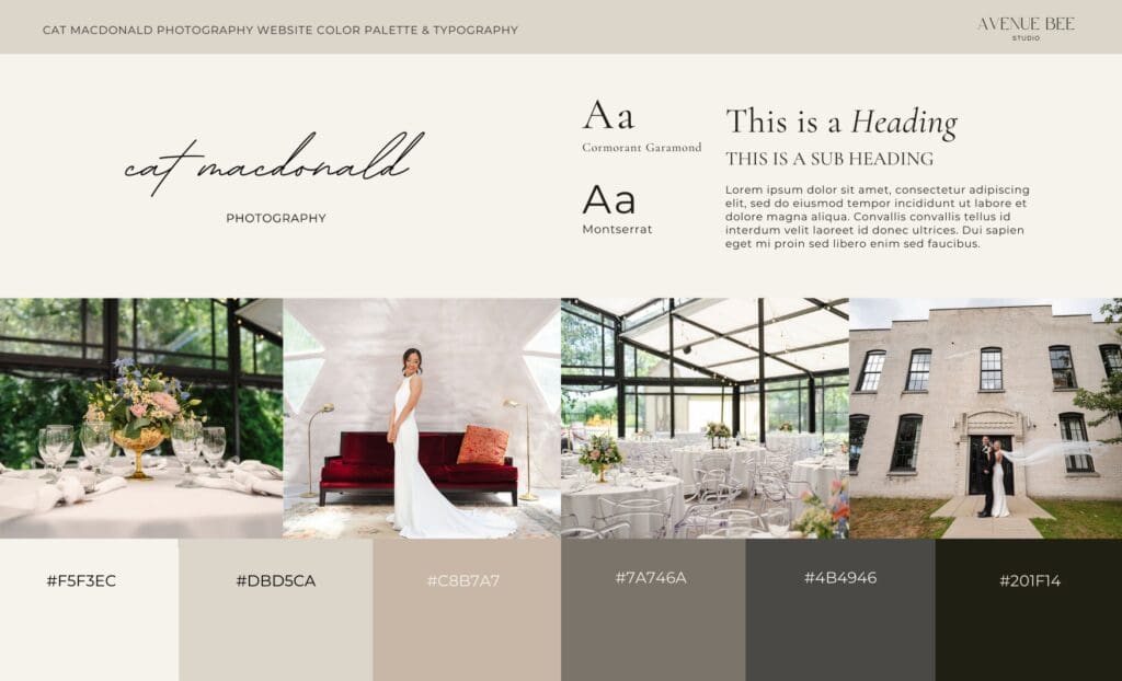
A premium website doesn’t rely on isolated beautiful sections. It relies on cohesion.
Colors repeat intentionally. Button styles are consistent. Image treatments feel aligned. Icons follow the same visual language. Nothing feels like it was added as an afterthought.
Cohesion signals control. And control signals maturity.
5. Strategic Restraint
One of the most defining qualities of a premium website is what it chooses not to include.
There’s no unnecessary animation. No overwhelming sliders. No excessive font combinations. No competing calls to action. Premium design feels calm because it’s decisive. It doesn’t try to impress. It communicates clearly and allows the work to speak.
Restraint requires confidence, and confidence reads as authority.
6. Thoughtful Architecture Behind the Scenes
What makes a website feel premium isn’t only what’s visible. It’s also how it’s built.
Navigation is intuitive. Pages are structured with purpose. Information flows logically from one section to the next. Visitors are guided, not overwhelmed. And while they may not consciously notice the architecture, they feel it.
When the experience is seamless, trust increases.
Premium Is a Strategic Decision
A premium website isn’t created by increasing your design budget alone. It’s created by aligning positioning, structure and visual refinement with the level of business you’re operating at. As businesses grow, their digital presence has to grow with them. What once felt sufficient can begin to feel crowded, inconsistent or slightly chaotic.
Understanding what makes a website feel premium allows you to evaluate your own digital presence more strategically.
When your website reflects your clarity, your pricing and your direction, it does more than look elevated. It supports growth. Premium isn’t a trend. It’s the result of clarity, cohesion and confident decision making.
If your digital presence feels slightly behind your growth, it doesn’t have to stay that way. Reach out to begin a strategic website build designed around clarity and structure.
< Back to all posts


