
How Photography Can Completely Change the Way Your Brand Feels

When people think about branding, they usually think about the obvious pieces first. Your logo, colors and fonts all play a big role in how your business looks, but photography can change the way those pieces come across more than you might realize.
You can take the exact same logo and pair it with three completely different sets of photos. Suddenly, you have three brands that don’t feel much alike at all.
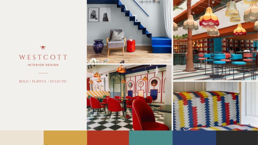
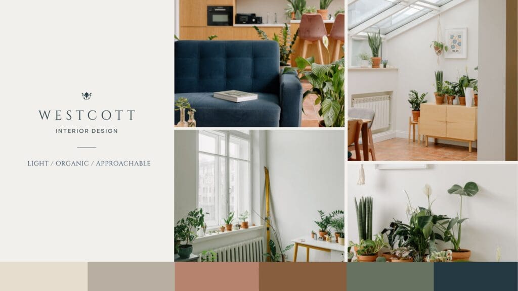
I wanted to actually show you what I mean, so I created a fictional interior design studio called Westcott Interior Design. I kept the logo and typography exactly the same across all three concepts, then changed the photography and pulled a new color palette from each set of images.
The difference is pretty dramatic.
Same logo, completely different brand
For the first concept, I chose interiors filled with bold color, pattern and unexpected details. The photography feels playful and a little eclectic, so I pulled cobalt blue, tomato red, golden yellow and turquoise into the palette.
The result feels bold, playful and eclectic.
For the second concept, I went in a completely different direction. These images are bright and relaxed with lots of plants, natural wood and warm terracotta. The colors I pulled from the photography are softer and more muted.
Now Westcott feels warm, organic and approachable.
For the third concept, I chose darker interiors with rich colors, vintage-inspired details and moodier lighting. The palette followed with deep green, burgundy, brass and warm brown.
This version feels moody, collected and refined.
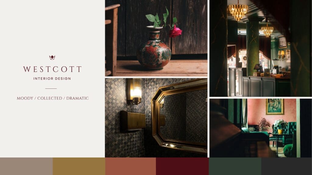
Nothing about the actual logo changed. Even the typography stayed the same. But if you saw these three brands separately, you could easily assume they belonged to three very different interior designers.
That’s how much weight your photography carries.
Your photos are part of your visual identity
This is one reason I don’t like treating photography as something we figure out at the end of a website project.
The photos take up a huge amount of visual space on most websites. For a creative business, they may take up more space than almost any other brand element.
They also give people information that your logo simply can’t.
Photography can make a business feel editorial or approachable. It can make it feel colorful, understated, romantic, modern, polished or relaxed. It can tell someone what kind of work you do and who you probably do it for before they’ve read much of the copy.
That’s especially important for businesses where the work itself is highly visual. An interior designer, florist or photographer can have beautiful branding, but the images still have to support the same overall direction.
Your color palette and photography should work together
One thing you’ll probably notice in the Westcott examples is that I didn’t choose the brand colors first and then go searching for photos that happened to match.
I let the photography help determine the palette.
You don’t need every photograph on your website to contain your exact brand colors. That would get repetitive pretty quickly. But there should be some relationship between the two.
If your brand palette is soft and earthy while your photography is bright, saturated and high contrast, those pieces may start competing with each other. The same thing can happen when you have a rich, dramatic visual identity paired with photos that feel light and casual.
Neither direction is wrong. They’re simply communicating different things.
Consistency matters more than having the “perfect” photos
This also doesn’t mean you need every image to come from one photoshoot.
Most businesses are working with a mix of brand photography, project photos, client work and older images. You may need stock photography in certain places too.
What matters is looking at the collection as a whole.
Do the photos have a similar warmth or coolness? Are some heavily edited while others feel very natural? Is the lighting fairly consistent? Do the images feel like they belong to the same business?
I’d rather work with a smaller group of photos that make sense together than fill a website with images simply because each one looks good on its own.
Before you change your branding, look at your photography
If your brand has started feeling a little off, your logo may not actually be the problem.
Sometimes changing the photography direction can completely shift how an existing identity comes across. A new set of images can add personality, make the brand feel more elevated or bring it closer to the kind of work you want to attract.
The Westcott concepts are an exaggerated example, but that’s exactly why I wanted to create them. The bones of the brand stayed the same. Once the photography changed, everything around it started to feel different too.
If you’re planning a new website or updating an existing one, don’t wait until the end to think about your images. They aren’t just there to fill space between sections. They’re helping tell people what kind of business they’ve landed on.
< Back to all posts


