
When the Project Brief Is Timeless, Classic & Heirloom

When J.Blu Design and I started talking about their new website, three words kept coming up: timeless, classic and heirloom.
Those words gave me a good starting point, but they can also mean very different things depending on the business. I wanted to figure out what they looked like specifically for J.Blu, especially since they already had an established brand and a beautiful portfolio of floral work.
Julie also shared that she loves Ralph Lauren, which helped fill in some of the blanks. Once I started looking at their existing brand colors, the way they package their flowers and the inspiration she was drawn to, the direction for the website started coming together.
Working with the brand they already had
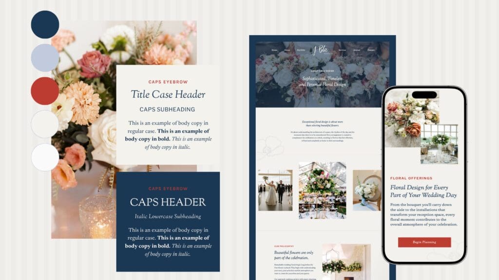
J.Blu already had an established color palette, so this project didn’t need to begin with completely new branding. I worked with their existing colors and focused on how they could translate across a much larger website.
Blue became one of the main colors throughout the site. It gave us a classic foundation that could repeat from page to page while leaving plenty of room for the floral photography to bring in additional color.
That was important because J.Blu’s work isn’t limited to one palette. One wedding might be filled with soft neutrals while the next has pinks, blues, greens or deeper seasonal colors. The website needed to work with all of them.
Keeping the foundation fairly restrained gave us that flexibility.
Pulling inspiration from Ralph Lauren
Knowing Julie loves Ralph Lauren also gave me a much better idea of what she meant when she described the direction as classic.
There are plenty of things you could pull from the Ralph Lauren world, but I was especially drawn to the way the brand uses traditional colors like blue while allowing photography, typography and styling to create so much of the overall feeling.
The color palette can stay relatively consistent while the imagery changes dramatically. That felt especially relevant for J.Blu because their portfolio needed to be the most colorful part of the website.
I took a similar approach with the site. Blue helps tie everything together, while the typography adds some of the elegance and the floral photography brings in the personality, texture and color.
Adding details that came directly from J. Blu
I wanted the website to have a few details that felt distinctly J.Blu, too.
One of my favorites is the stripe pattern you’ll see throughout the site.
J.Blu uses striped ribbon when wrapping flowers, so stripes already existed within the visual world of the business. Bringing that pattern onto the website gave us another element to work with and added some personality without feeling out of place with the classic direction.
I love finding details like this during a website project because they make the design feel more connected to the actual business. Someone visiting the site may never consciously think about the stripe pattern matching the ribbon on a bouquet, but the connection is still there.
Choosing typography that felt classic without feeling dated
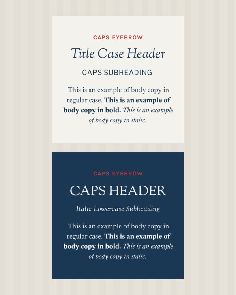
Typography was another big part of getting the balance right.
I wanted something that felt editorial and established, with enough personality to stand alongside J.Blu’s floral work. At the same time, the website still needed to feel current and easy to navigate.
The serif typography brings in some of that classic character, while the simpler supporting type keeps longer sections clean and readable. I also played with scale throughout the site so typography could become part of the design without adding more decorative elements.
Between the type, stripes and color palette, we had enough visual interest to create variety throughout the website while still leaving plenty of room for the photography.
Giving the floral work room to speak for the brand
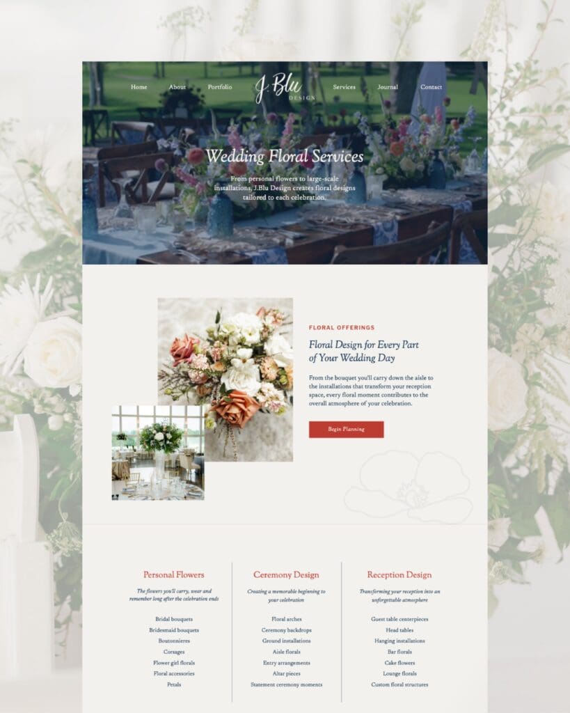
J.Blu already had an incredible library of wedding photography, and I knew from the beginning that those images needed to have a major presence on the website.
Their work has plenty of color, texture and detail on its own. Instead of trying to recreate that through the website design, I used larger images throughout the site and gave them space to make an impact.
That also means weddings with completely different styles can live comfortably within the same website. A colorful summer wedding and a more neutral ballroom celebration still feel like part of the same J.Blu portfolio because the design surrounding them stays consistent.
The website gives the photography a framework without trying to compete with it.
Making the portfolio feel like more than a gallery
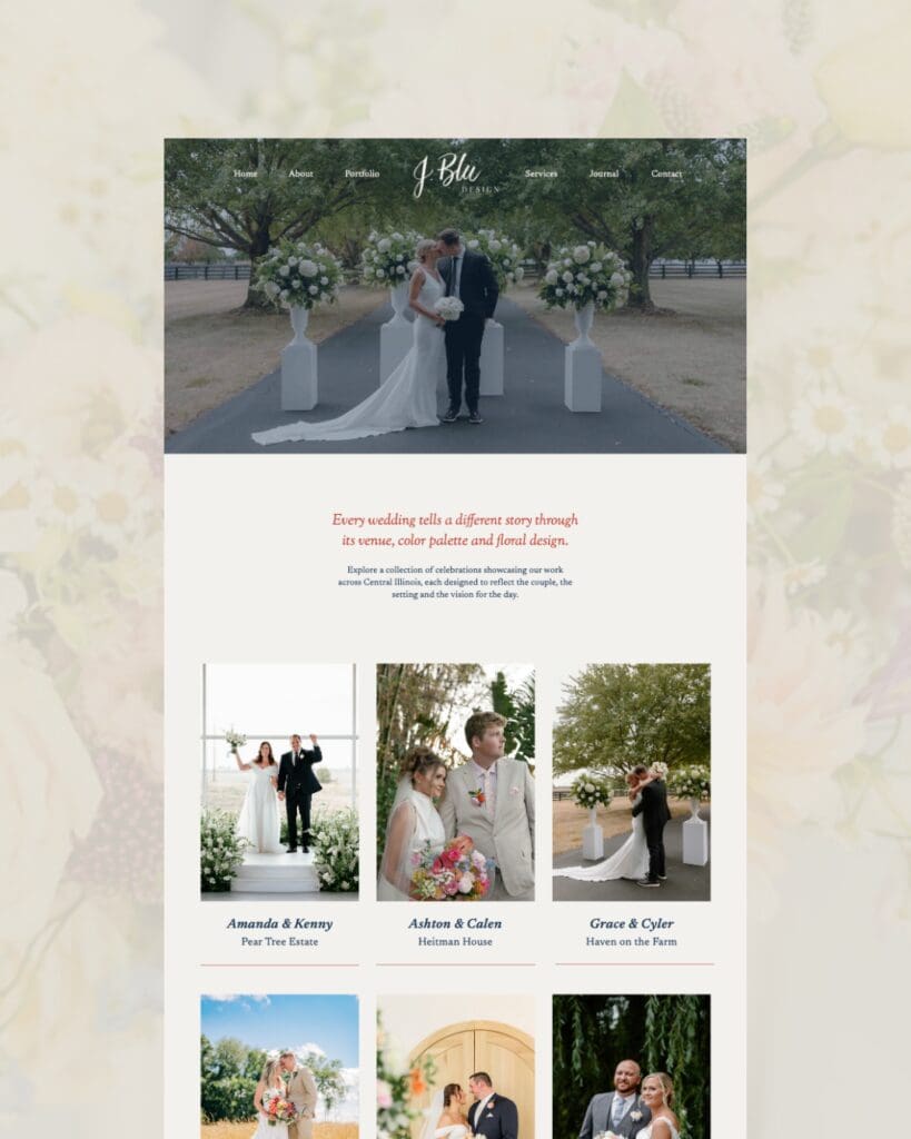
The portfolio was especially important for this project because potential floral clients want to see more than a handful of beautiful arrangements.
They want to see how the flowers carried through an entire wedding. They want to see the ceremony, reception, wedding party and all of the smaller details that bring everything together.
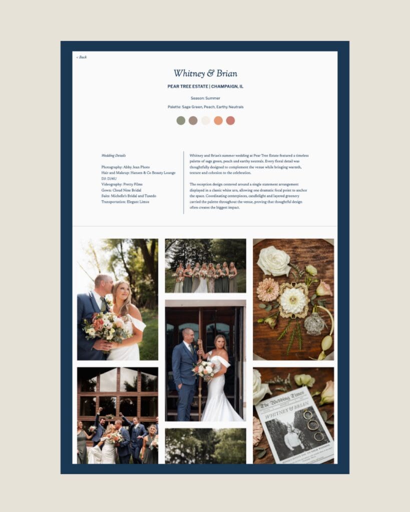
I built the portfolio around individual weddings so each one has room to tell a fuller story. That gives someone considering J.Blu a much better sense of their range and the scale of the work they can create.
It also made the portfolio feel more editorial, which fit naturally with the rest of the design direction.
Bringing timeless, classic and heirloom to life
The three words we started with stayed in the back of my mind throughout the entire project, but they weren’t a formula I could simply apply to the website.
The final direction came from combining those words with everything that already made J.Blu recognizable. Their existing colors, striped ribbon, floral photography and Julie’s love of Ralph Lauren all helped define what timeless, classic and heirloom should look like for this business.
That’s one of my favorite parts of designing a custom website. The goal isn’t to take an aesthetic and apply it to every client who likes it. I get to figure out what that direction means for the individual business and build from there.
For J.Blu, that became a website filled with classic blue, editorial typography, subtle stripes and plenty of space for the flowers themselves to make an impression.
And I think it feels very J.Blu.
< Back to all posts


